EEvlarSoft

WebToImage

Turn any website into an image at four screen sizes in one run, so you can see how a page really looks on a phone, a tablet, a laptop and a big monitor.

Buy for $1.99
One payment. No subscription.
14-day money-back guarantee.
5.0
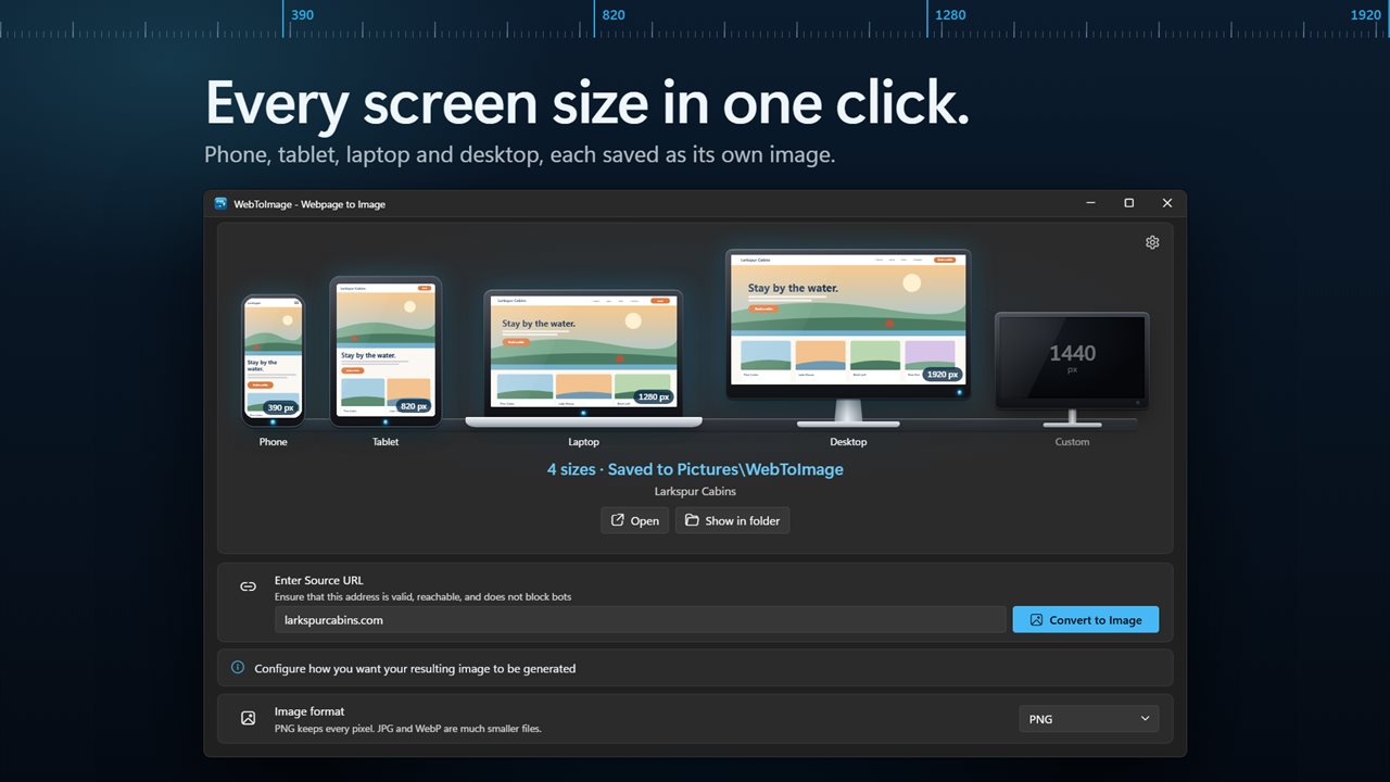
Capture a webpage at phone, tablet, laptop and desktop widths in one click.
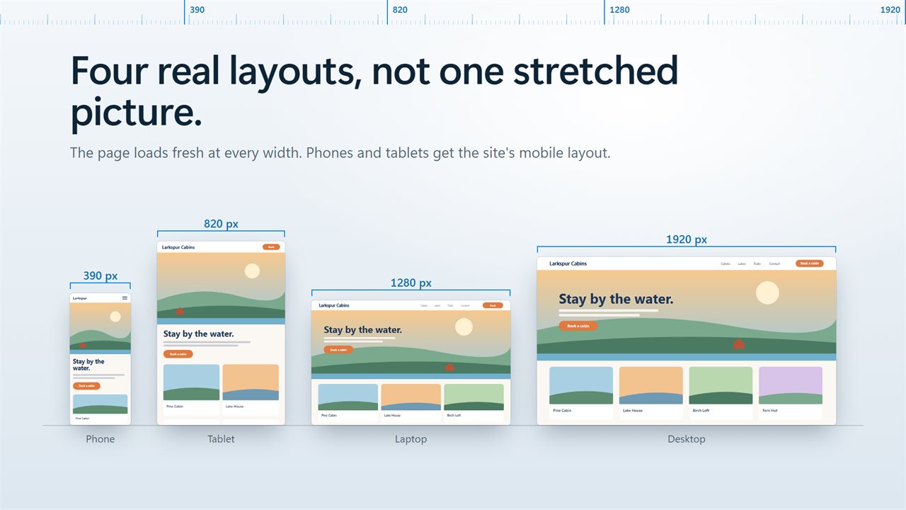
The page loads fresh at every width, so each image shows the real layout.
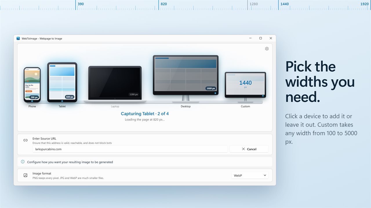
Click a device to include its width or leave it out. Add any custom width.
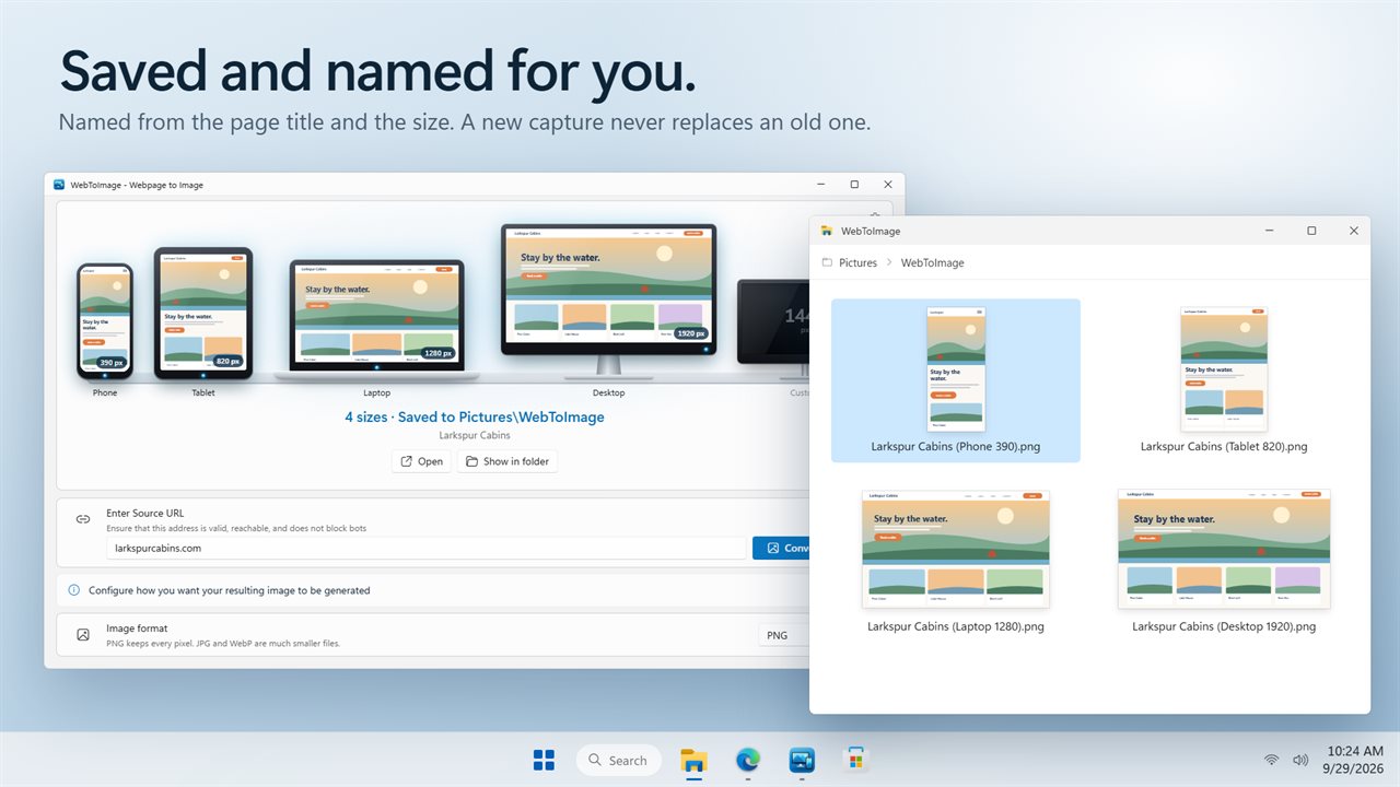
Every image is named from the page title and its size.
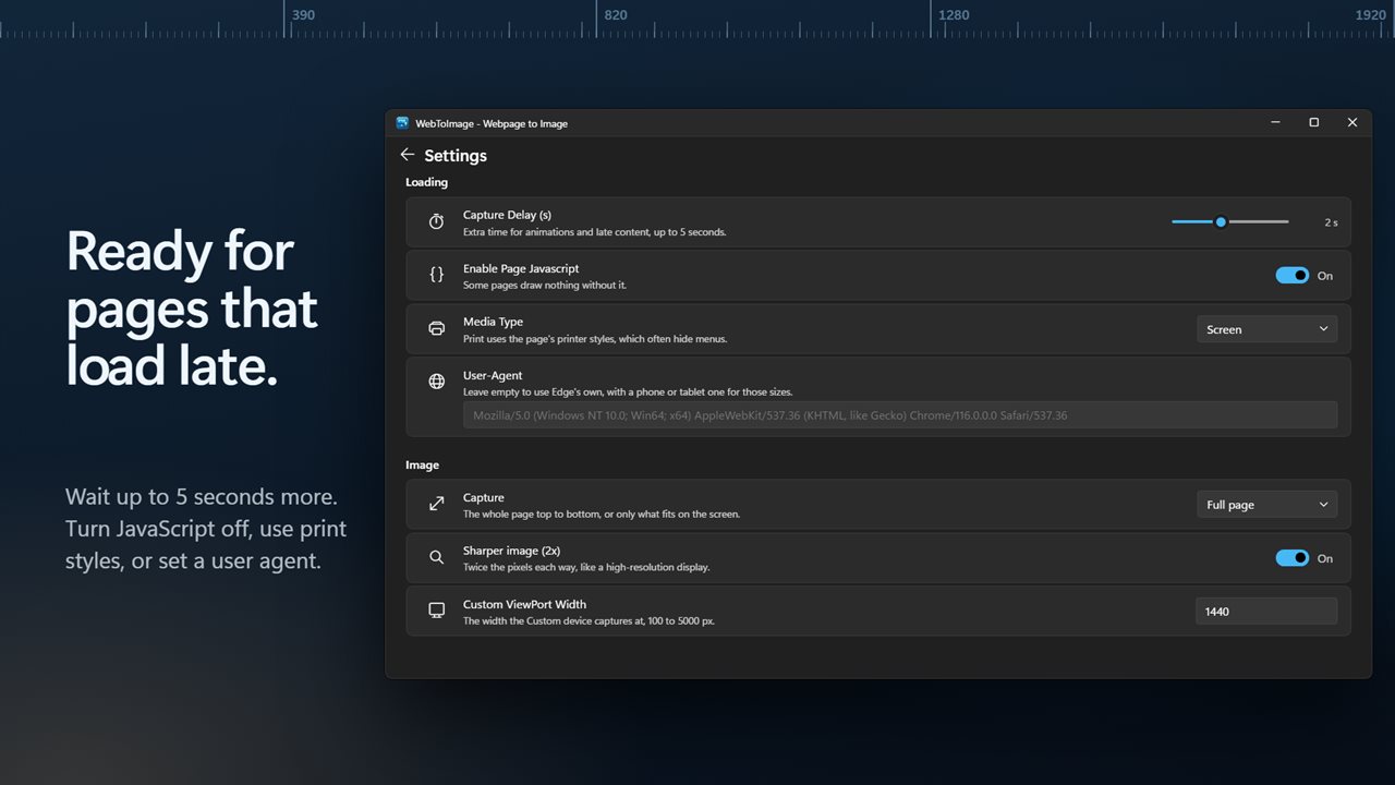
Wait for late content, turn JavaScript off, or set your own user agent.
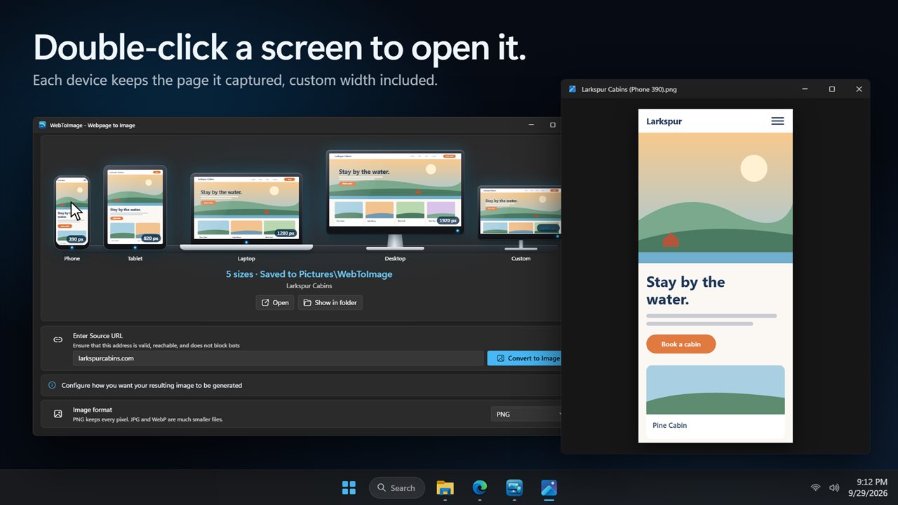
Double-click a device to open the image it captured.

Capture a webpage at phone, tablet, laptop and desktop widths in one click.

190,000+downloads of EvlarSoft apps
Signed by EvlarSoftVerified US publisher
14-day money-backNo questions asked
Updates includedNo upgrade fees

Convert a website to an image the way each visitor sees it

Most website to image tools take one screenshot at one width. If you want to know how a page holds up on a phone, you run it again with a narrower setting and hope the site notices. Often it does not, because many sites decide their layout from the browser's identity and touch support, not just its width.

WebToImage captures the same address at Phone (390 px), Tablet (820 px), Laptop (1280 px) and Desktop (1920 px) in a single pass, plus an optional Custom width anywhere from 100 to 5000 px. For phone and tablet it emulates a mobile device and identifies as a mobile browser, so sites that serve a separate mobile layout serve it here too. The page is reloaded for every size, which means each image is a genuine render rather than one picture scaled down.

Because the capture runs on your own PC rather than on a remote server, it can reach pages a web service never could: a dev server on localhost, a staging box on your office network, or an HTML file sitting on disk.

How to test a website on different screen sizes

Enter Source URL takes an address with or without https. A bare domain works.

  • Click the device drawings to choose which Screen sizes to include. A device you click again is left out.
  • Include the Custom screen and set Custom ViewPort Width for a breakpoint of your own, such as 1440 or 768. Its drawing stands tall or lies flat to match the width.
  • Press Convert to Image. Each device fills in with its capture as it finishes; double-click one to open the image.
  • Compare them side by side in File Explorer, where each file name carries the device and width, like Pricing (Tablet 820).png.

Webpage to PNG, JPG or WebP

PNG is lossless and keeps text and interface edges crisp, which suits design reviews and bug reports. JPG and WebP are far smaller, better for email, chat or a slide. Pick Full page for the whole scroll height, or Visible area for just the first screen, the part a visitor sees before scrolling.

Sharper image (2x) doubles the pixels in each direction, the same as a high-density laptop or phone display. It is the setting to use when the images go into a portfolio, an app-store mockup or a printed proposal.

Getting a clean capture of slow or script-heavy pages

Images that wait for scrolling before loading are pulled in before the shot, so a long page does not end in empty boxes. Capture Delay (s) adds up to five seconds for carousels, fonts and animations to settle. Enable Page Javascript can be switched off to see a site's no-script fallback, Media Type set to Print shows the page with its printer styles, and a User-Agent field lets you pose as any browser you need to test.
At a glance

  • Four device widths plus one custom width captured in one run
  • Mobile emulation and a mobile browser identity for phone and tablet sizes
  • PNG, JPG or WebP, full page or visible area
  • Sharper image (2x) for high-density output
  • Works with localhost, local IP addresses and file:/// pages
  • Lazy-loaded images fetched before capture, with an optional delay of up to 5 seconds
  • Files named from the page title and size, never overwriting an earlier run
  • Saves to Pictures\WebToImage or a folder you choose, with Open Image when complete

Who it is for

Web developers checking breakpoints

Point it at a local dev server and get every breakpoint as a file to attach to a pull request or a bug report.

Designers and agencies

Send a client one set of images showing the new site on phone, tablet and desktop instead of asking them to resize a browser.

Marketers and writers

Grab mobile and desktop views of a landing page for a case study, a slide deck or a before-and-after comparison.

What's new in 2.0.3

  • New: capture phone, tablet, laptop and desktop widths in one go, plus a custom width
  • New: phone and tablet sizes get the site's mobile layout
  • New: each device shows the page it captured. Double-click it to open the image
  • New: save as PNG, JPG or WebP, the whole page or the visible area, and sharper 2x images
  • New: images are named from the page title and never overwrite an earlier one
  • Bare addresses like example.com now work
  • Cancel now stops the capture straight away
  • Your capture delay is now remembered
  • The window fits smaller screens
  • Your Open Image when complete setting carries over

Questions

Anything else? Ask us

What screen sizes does it capture?

Phone at 390 px wide, tablet at 820 px, laptop at 1280 px and desktop at 1920 px, plus one custom width from 100 to 5000 px. Each size you leave switched on is captured in one run and saved as its own image.

Does the phone size show the site's real mobile layout?

Yes. The page is loaded fresh at each width, and the phone and tablet sizes also emulate a mobile device and send a mobile Android browser user agent, so sites that choose their layout either way serve the mobile version. A custom width under 1100 px is treated as mobile too.

Can it capture pages I'm logged in to?

No. Each run uses a new, empty browser profile, so it has none of your sign-ins or cookies. A page behind a login is captured as a visitor who is not signed in would see it.

Is there a limit on how long a full-page capture can be?

Yes. A full-page image is cut off at 16,384 pixels, and the app tells you when a page was cropped. With Sharper image on, the image has twice the pixels, so the cut comes at half the page length.

Do I need Microsoft Edge installed?

It uses Microsoft Edge, which comes with Windows, running in the background without a window. If Edge is missing it uses Google Chrome instead, and it shows an error if neither is found.

Can it capture a local page or a site running on localhost?

Yes. Addresses like localhost:3000 and local network IP addresses open over http, and a file:/// address opens a page saved on your PC. A bare address like example.com is opened over https.

Can I convert a website to JPG instead of PNG?

Yes. Image format offers PNG, JPG and WebP. JPG and WebP files are much smaller; PNG keeps every pixel.

Will a second capture of the same page replace the first images?

No. A new run adds a number to the name, such as Home (Phone 390) (2).png, so earlier images stay where they were.

Which versions of Windows does it run on?

Windows 10 (version 1809 or later) and Windows 11.

Is it a subscription?

No. WebToImage is a one-time purchase of $1.99, and updates are included.

How do I get it?

Buy it on this page and your license key arrives by email. If the button says Notify me, WebToImage is not on sale here yet; leave your email and we will tell you when it is.